Hello everyone,
I was putting together my Monday Movie last week, and I realized that the 3dsMax Ink n Paint material is pretty robust. In this primer, we’ll be walking through the material looking at some visual examples of each feature. By the time you’re done, you’ll have a firm understanding of how to use this often misunderstood material. You’ll even walk away with a few keen tips on how to achieve unusual effects! This first page is devoted to quickly going through the tools at our disposal. The next page is where we’ll get rambunctious and see what crazy things we can cook up! Everything you read here is pretty much renderer agnostic- you could use either the 3dsMax Scanline renderer or the mental ray renderer.
Material Basics
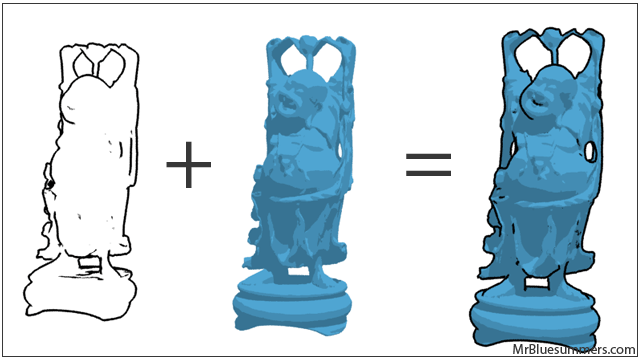
If you’re going to read one paragraph in this entire primer, it should be this one. The Ink & Paint material is basically a combination of two elements- inked edges and color that fills the shapes they outline. While these two elements are housed in the same material, it’s best to think of them separately. They’re rendered this way too; the object is rendered using a rough shading technique, and then an edge detection algorithm adds the boarders to create the final effect.
Some of what we’ll cover later can seem a little mind boggling, but in the end it pays off. This material is a wonderful compliment to any architectural rendering pipeline, and even those of you in the video game industry would do well to know the ins-and-outs of cell shading.
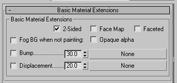
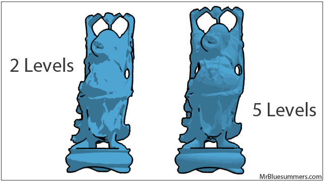
The standard parameters of the material should be pretty familiar to you. Lucky for us, the default 3dsMax Ink n Paint material supports bump and displacement mapping. This means that you can apply the material to characters or objects with high-frequency details, as well as to terrains and objects who’s form is heavily influenced by a displacement map. The only non-self-explanatory feature here is ‘Opaque alpha’ which will cause the image alpha to be affected by areas that would be painted regardless of whether they’re actually being painted or not. I.E. If this feature is on, but the material does not have paint (like the far left example in my first image), the interior of the statue would still be white in the render’s alpha map.
Paint Basics
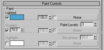
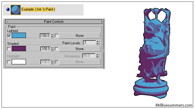
The paint controls allow you to take charge of the lit, shaded, and highlight aspects of the material. The lighted section controls whether there is any paint at all in the material- if the checkbox next to the blue swatch is unchecked, you’ll get the ink-only effect. On the other hand, unchecking the “Ink” checkbox under the Ink Controls will yield a paint-only effect.
Under each of these groups you’ll see spinners denoting the blend between a map (if you chose one) and the swatch color. The glossiness parameter operates similarly to an ordinary material; it controls how sharp the highlights are from reflected light sources. Finally, the paint levels spinner controls how many ‘steps’ there are in the paint effect. Values too low (like 2) could hide details in your render, but values too high (like more than 10) could destroy the paint effect.
Ink Basics
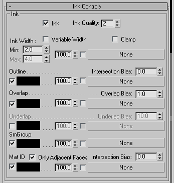
The ink parameters let you control how the 3dsMax ink algorithm does its job. You can control whether the ink is rendered at all using the “Ink” checkbox.
The width of the ink lines drawn during the render can be controlled by the “Ink Width” parameter group. There are two spinners ‘Min’ and ‘Max’ and they, of course, control the minimum and maximum width of the ink lines. In the image shown here, the ‘Variable Width’ checkbox is unchecked, so the lines will always be the same width: 2 units. If I were to check that box, I would have complete control over the width of the ink lines.
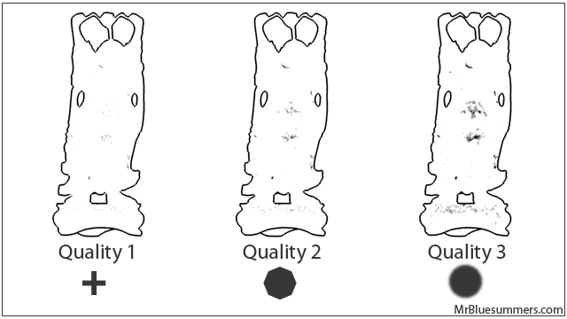
The ‘Ink Quality’ parameter spans 1-3 and can be used to adjust the speed/quality tradeoff of your render. The image below shows the Buddha statue rendered identically except the ink quality was adjusted. Notice that the statue that has the higher-quality ink material has noticeably more detail in certain areas. This is because the filter has softer edges (shown at the bottom of each example), and because the renderer biases itself to areas where ink might appear.
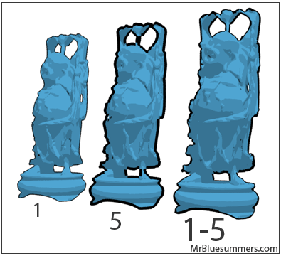
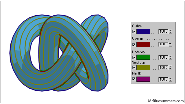
Let’s take a quick look at the next few parameters all at once. Outline, Overlap, Underlap, and so on all control the different line types. 3dsMax’s Ink n Paint material can distinguish between different line types, and render them with different styles. Some lines go along the outer border of the object. Others are where the object overlaps with itself. Still others happen across smoothing groups within the object. The bias spinner controls how aggressively these lines should be accentuated (just like in the ‘Overlap Bias’ example earlier). Note that the bias is in absolute units (as opposed to relative units), so very small 3d models or very large 3d models may respond unpredictably to changes in these parameters. Below is an illustration of the different line types (much more digestible than a dry description). In this Torus Knot, I kept the smoothing groups in strips to demonstrate that line group. The only line type not represented here is Material IDs, but I think you get the gist of it.
Ink n Paint Material Experiments
And now the moment you’ve been waiting for is here! Let’s fire up this material and see what kinds of effects we can get. If you put your mind to it, you can really accomplish a wide variety of effects using the Ink n Paint material in 3dsMax. Each of the following experiment types is unique in it’s own way, but you’ll see how it ties into the concepts we discussed previously. The first is an exploration of the paint aspects of the material in mental ray; let’s see how far we can go in changing up the paint material. The second is an exploration of the ink features to see what kind of sketch effects we can make- similar to the Monday Movie I made a few days ago. Finally, the third is a few clean, yet stylish applications that bring the first two explorations together.
Extended Paint
In mental ray we have a wealth of advanced shaders at our disposal. Better yet, these shaders are modular enough to be maps instead of full-blown materials. Thus, we can start applying these into the paint and shade slot of the material in order to start arriving at some very unique effects. We can accommodate everything from Ambient Occlusion to Car Paint. Let’s try a few examples.
The image below starts off simple and uses two separate color swatches to instruct the Ink n Paint material to go from a light blue in lit areas to a darker purple in shaded areas. You can create simple color combinations in this way.
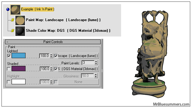
Overall this is a rather trivial setup. Let’s look at something more complex. Below I’ve taken the same material, but applied a map to the Paint Map slot and one to the Shade Color Map slot. The first is a Landscape (lume) map that dynamically generates color based on the geometry and orientation of the object. Notice that the rendering of this map does not adhere to the idea of ‘paint levels’. Instead it’s a very explicit map. In the same way, the DGS map I applied to the Shade Color Map slot has highly detailed levels of brightness and color in it- as though it were not part of the Ink n Paint material. What the ‘Paint Levels’ is controlling in this example is the transition from the Landscape map to the DGS map.
Extended Ink
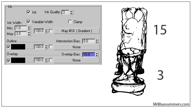
The paint render effects you can generate using the above techniques are extensive. Let’s now investigate these ink parameters and stretch them into something that goes beyond merely supporting the paint effects. For starters, we can alter the bias parameters for each of the line types. In the image below, I’ve made a change to the “Overlap Bias” parameter, which controls how aggressive the line drawing algorithm is. Very low numbers will make the effect more extreme, while very high numbers will make the effect more subtle. As I mentioned earlier, remember that these bias spinners are not relative values! You shouldn’t need values beyond the range of 0-20 in order to produce this kind of effect. In the image below, notice what a powerful sketch effect I’ve created just by altering one parameter.
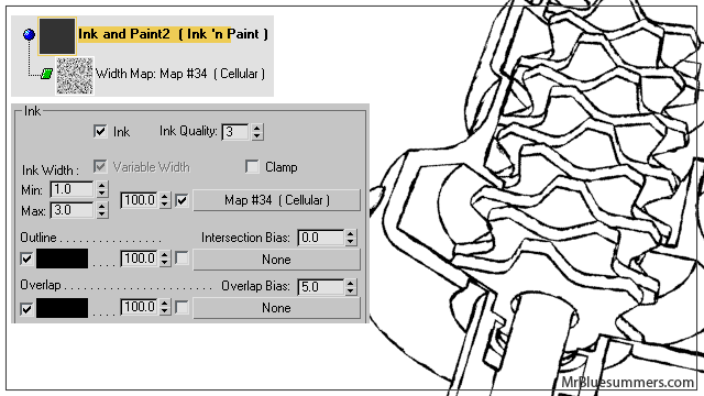
Let’s have a look at how we can use maps in the 3dsMax Ink n Paint material to alter how the lines are drawn over objects. Using maps to control the line width can have a subtle but clear impact on the final render. Ordinarily, we could allow the renderer to handle when to use thick and thin lines. However, using an image or procedural map can help the engine get away from the dry, clean-cut look of a render. In the image below, I applied a noise map to the line width map in order to ‘muddy up’ this mechanical render. The effect is kept under control by keeping a tight minimum and maximum width (1-3).
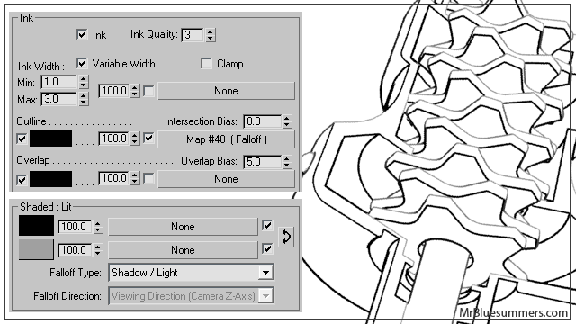
Below is one more example where I applied a falloff map to the line color map slot. This map was set to Shadow/Light and spans from perfect black at the most illuminated to a 160 gray at the least illuminated. This assures that a) we’ll always get at least some shading during the render, and b) the most illuminated sections will get the darkest lines. You can be quite creative with these maps.
Extended Material
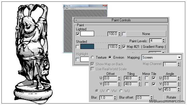
Now that we’ve explored some of the tools available, let’s get crazy and see what kinds of effects we can get when we put the two together. In the example below, I’ve combined two effects we covered earlier. First, I’ve made the line drawing algorithm moderately aggressive by turning the Overlap Bias to a lower value. Then, in the shaded slot I’ve inserted a static gradient ramp set to tile with high frequently. It’s mapped to “Environ->Screen”, and rotated 45 degrees so that it looks the way we need it to.
This creates a lovely effect.
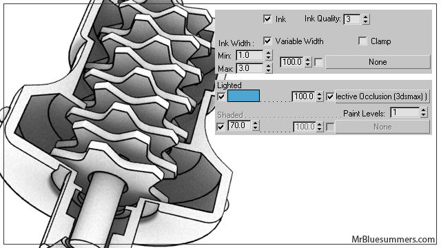
What I’ve done below may seem obvious, but when executed with subtlety, 3dsMax’s Ambient Occlusion map can be an excellent lighted paint map in the Ink n Paint material. I’ve assigned it here with only 1 paint level so that we don’t get the stepping effect at all. It may seem like a waste, but the real power here is in the Ink overlay on the ambient occlusion render. In the render below, you can see how the subtle shading (from white to gray) combined with the hard, clean ink lines creates a very potent render that’s perfect for showing off that new cell phone prototype.
And that’s the rundown. We’ve taken a hard look at the two major sections of 3dsMax’s Ink n Paint material (not surprisingly “Ink” and “Paint”). We then investigated some of the more robust effects we could accomplish by changing parameters to values we might not think of right away. I hope you’ve found this primer insightful, and remember to check back every Monday for my Monday Movies!
By 3dsMax Ink 'n Paint Primer Tutorial | MrBluesummers.com June 17, 2009 - 8:02 pm
[…] Click here to read the tutorial! Tags: Help, Materials, mental ray, Scanline, Tutorial Category: Blog, Tutorial You can follow any responses to this entry through the RSS 2.0 feed. You can leave a response, or trackback from your own site. Leave a Reply » Log in […]
By Jeff B. September 23, 2011 - 2:56 pm
Compliments on the many excellent tutorials you have created. Parts of Ink n/ Paint above had me saying: why didn’t I think of that! Might be just the thing I need for a current project.
By Mr. Bluesummers February 21, 2012 - 5:22 pm
Glad you liked it Jeff! 😀
By John S October 9, 2012 - 2:51 pm
This is a great overview on the many facets of ink n’ paint. Have you run into the problem that shift+dragging out a copy of an ink n’ paint material (in the slate editor) doesn’t make a unique copy? modifying the parameters of the ‘copy’ still change the original. This doesn’t seem to happen on the standard materials.
By texturing | Pearltrees March 11, 2012 - 12:01 am
[…] 3dsMax Paint Levels Comparison Ink & Paint Primer | MrBluesummers.com […]
By Leo_Aguiar March 22, 2012 - 2:38 am
Ink and paint don´t seem to behave properly in orthogonal views. Does this happen with you also? Is there a way to get them to work properly in orthogonal views?
By Fliers12 June 5, 2012 - 8:03 pm
Leo, I noticed this as well. The way you fix it is you create a camera similar to your orthogonal view (ex. front, side top). Then in your camera parameters check the “Orthographic Projection” box at the top of the menu. This will automatically adjust your camera to be the correct Othogonal view and not a perspective view. Now when you render it will use the ink and paint material correctly.
By sandcoder April 6, 2013 - 1:04 am
WarningInk ‘n paint will only give correct results when rendered from a camera or perspective view. It does not work in orthographic views.
from the help in max..
By William June 5, 2012 - 10:41 pm
Great Tutorial.. Ive looked into this MAX ink and paint some myself.. and ofcourse I always have questions.. so Im glad to find someone else who has had some similar pursuits. I wonder… have you ever noticed.. that when you zoom in and out.. on say.. a cube with the ink paint shader applied.. the ink width to the size of the cube ratio does not stay consistent ? Any way to fix this ? – In other words.. as I zoom out on my cube.. I expect the width of my Ink outlines to get thinner. Hope to hear from ya !