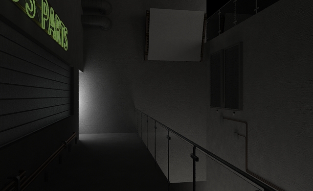
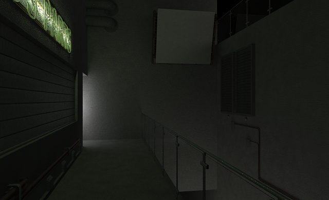
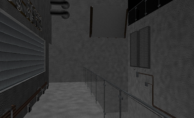
Lighting in a scene can make a huge difference for your final composition. As I’ve said many times before in my tutorials and videos- your lighting and materials are keenly interconnected. Your lighting setup can make a huge difference in your scene’s mood. It can hint at details that aren’t visible. It can make your materials more realistic. It can make or break your scene.
In this tutorial we’ll be looking at an example science-fiction scene that you can illuminate however you like. We’ll look at
- Creating detail outside the field of view,
- Using materials as light sources, and
- Making the most of photometric area lights
increase t
Download the Starter Scene
Start this tutorial by downloading the starter scene. This .zip file contains the scene file (3dsMax 2012) and a JPEG we’ll use later in the tutorial. The materials I used are the standard Autodesk materials, so you shouldn’t need any additional maps. And remember, we’re interested in the lighting and not in the materials.
Create the Ambient Lighting
Our first set of lights are ambient. They define the overall values we’ll be working in and help to bring contrast to major areas of the scene. We’ll add area lights over the ledge, around the corner, and on the upper level.
The Ledge Lights
Let’s start off by creating a free light from the command panel on the right.
Notice that this will also force you to set up Photographic Exposure Control. Photographic exposure control allows you to have more realistic control over the relative lighting valuesin your scene. It’s like rendering an HDRI or a photograph and controlling the exposure value. This gives you a wonderful level of control.
From here, press the “8” key on your keyboard or go to “Rendering”>>”Environment” in the menu bar toincrease open the Environment and Effects panel.
Place the light anywhere in your scene, and drag it under the ledge to the right of the camera as shown below. Be sure to also copy my area light settings (I’ve highlighted them in the image below, too):
- Make sure Ray Traced Shadows is “On”.
- Make sure to turn down the intensity to 150 cd.
- Make sure to set it to a “Rectangle” shape of 10 meters by 2 meters.
Take a render from the camera to see your progress. Notice that this light killed the default lighting setup and has darkened the rest of the scene. This is where Final Gather comes in handy.
To help you get more practice with this light and its positioning, copy it (as an instance) to the upper level and change the color from white to a warm orange. This will simulate the look of warm light sources and give your render more illumination.
The Corner Light
Create a new Photometric free light and place it in the doorway across from the camera. Make sure it’s hidden entirely around the corner, and match the following settings:
- Make sure Ray Traced Shadows is “On”.
- Make sure to turn down the intensity to 18 cd.
- Make sure to set it to a “Rectangle” shape of 8.5 meters by 2 meters.
You can see from the image below that we’re getting closer to what we want, but the intensities are off balance. The light from below is more subtle than the light from the hallway on the left, so we’ll need to balance those out later. For now, we’re getting more and more realism.
Create the Primary Lighting
The Shop Sign
Let’s add in the shop sign. This light can be created with a standard material with a “Glow (lume)” map as the diffuse slot and an area light. We’ll be following my Glow (lume) video tutorial. Long story short, just create a new Standard material, set the Diffuse slot to a Glow (lume) map, and follow the settings in the image below.
Let’s take a quick render with the material as-is. You’ll see why we need the extra area light.

While you can see some illumination from the sign, its clearly not enough. We want it to look like it's turned on.
In order for the sign to appear illuminated, we’ll need to place a cylindrical area light over the same space. Create another “Free Light” from the Photometric Lights menu and place it directly in the center of the neon sign. Follow my settings:
- Make sure Ray Traced Shadows is “On”.
- Make sure to turn down the intensity to 100 cd.
- Make sure to set it to a “Cylinder” shape of 4 meters by .28 meters.
- Scale the area light so that it looks squeezed and doesn’t intersect the wall.
- Make sure the color of the light matches the color of the neon sign!
Increase the exposure value in your Environment panel (hotkey “8” by default). Change it from 4 to 5, and notice that our image got darker. This will make sure there’s room for further refinement of the overall lighting solution. Generally, I’d rather darken my solution thus far and re-illuminate with a skylight than keep trying to tweak the current values relative to each other. I’m also going to turn down the value of the neon sign from 100 cd to 75cd.

This is the same image with reduced exposure value. Darker, and ready for another round of lighting.
The Advert and Additional Lighting
Next we’re going to create an advert on the billboard that will add some flair to the scene. I’ve included an image from Coca-Cola in the ZIP file for this tutorial. Use it to create a self-illuminated glowing material like we did for the sign. The billboard should already have the proper UVWs setup- just create the material and apply it as I’ve done here.
Now that the material is set up, let’s take an initial render. I already have a feeling we’ll need to add a rectangular area light in front of the advert to boost the light output and flood the scene with more red light.
Add another rectangle light as you’ve done before, and position it in front of the advert. It has no front or back, so don’t worry about which direction it’s facing. Just make sure it’s the right size. Notice my light placement and settings below; I selected a dark pink color because the billboard is red and white. The cd value is 75, which should keep the effect noticeable but subtle.
Wrapping Up
Consider our starting image and finishing image. What a huge difference illumination can make!
Make no mistake, this image is far from perfect. The subject is uninteresting, the materials are bland, and it’s missing key elements like a background. But you can see my point clearly- we went from “abominable” to “better than most beginner images”. Consider the impact of lighting on your scene carefully, and remember that you can use lighting offscene to enhance what’s in view.


By comeinandburn April 9, 2013 - 5:35 am
Hi, love your site and I’d really like to follow along with this. Is it possible to upload the scene files in obj instead of .max files. I don’t use 3d Studio Max:)
thanks!
By O.Güven May 4, 2013 - 12:15 pm
Your web site and youtube channel is awesome 🙂 They are treasure for 3ds max users 🙂